Donation platform Podkrepi.bg
0% fee,
open-source,
1M raised with 0 investment
Won “Site of the year”, and “agent of change”
100% made from volunteers with love.
Date: Nov. 2020 –
My Role: Design Lead, User Research, Design Team management, Branding
The team: Managing and organising upto 8 designers, collaborating with Front End specialists, Project Managers, CEO, Technical lead,
Marketing, QA and Financial and Legal team
Deliverables: User Flows, User Interviews to support User Stories, Information Architecture, Info Website Design, UX
Roadmap, Customer Journey Map, Service Blueprint, Infographics
Problem statement: How might we design a digital experience that rebuilds public trust in donation organizations and organizers, ultimately increasing support for people in need
Challenges: To organise and motivate a team of volunteers, deliver a high quality product, understand the users and the
“market” and give the best possible solution with the minimum possible fees – all managed online.
Results:
- 4% increased conversion due to simplified and integrated donation flow
- Embedding research in to our workflow and data driven solutions in organisation
- Designed new revenue streams, results from our research and ideations
- Organise, motivated, led and delivered product to support people in need
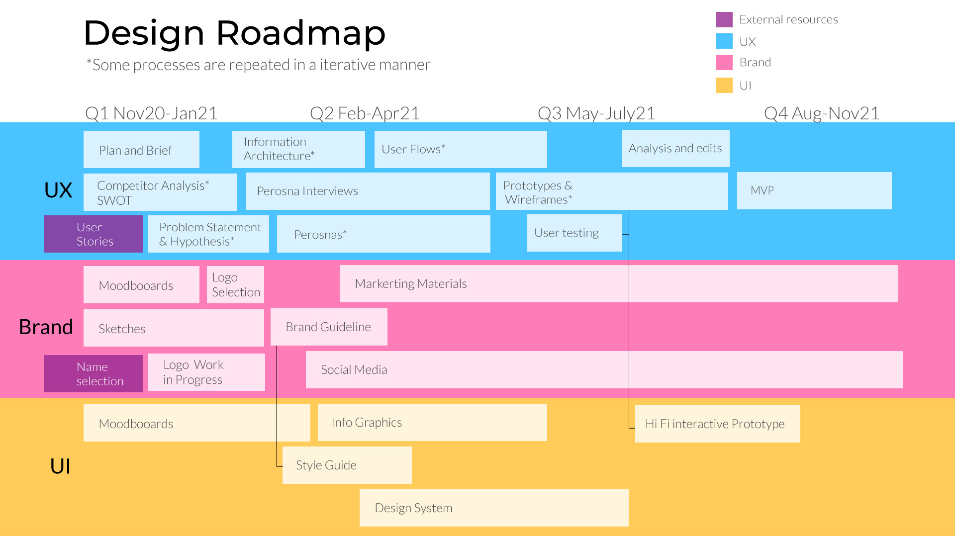
How everything started.
Below you can see my initial planning
1. Plan and Brief
2. Research
2.1. Competitor Analysis SWOT
2.2. Persona Interviews
2.3. Problem Statement & Hypothesis
3. Design
3.1. Information Architecture
3.2 . User Flows
3.3. Low Fi Prototypes and
Wireframes
4. Usability testing
5. Iterations and refinement
1. Moodboards
2. Sketches
3. Logo work in progress
4. Vote and selection
5. Brand Guideline
6. Social media images
7. Marketing Materials
1. Moodboards
2. Design System – UI kit
3. Hi Fi prototypes
Requirements and Plan
Background:
Podkrepi.bg is a Non-Governmental Organisation founded by 700 professionals with the idea of a 0% fee and
transparent online donation platform with open source.
Plan:
I started by crafting the Design Team Roadmap split into 3 areas: Branding, UX, UI. We agreed on the map – Its current
form can be seen here
Actions:
We adapt a plan with over 300 Agile’s User Stories. I put forward a strategy how to enhance the user stories, by doing a
series of user interviews with our defined Personas.
Results:
- Building one of the best teams in the project
- Emphasizing on user centred approach within the organisation
- Problem Statement & Hypothesis – which helped us to keep measurement of the success
- Competitor Analysis – to compare available solutions on the platform landscape
Needs Landscape
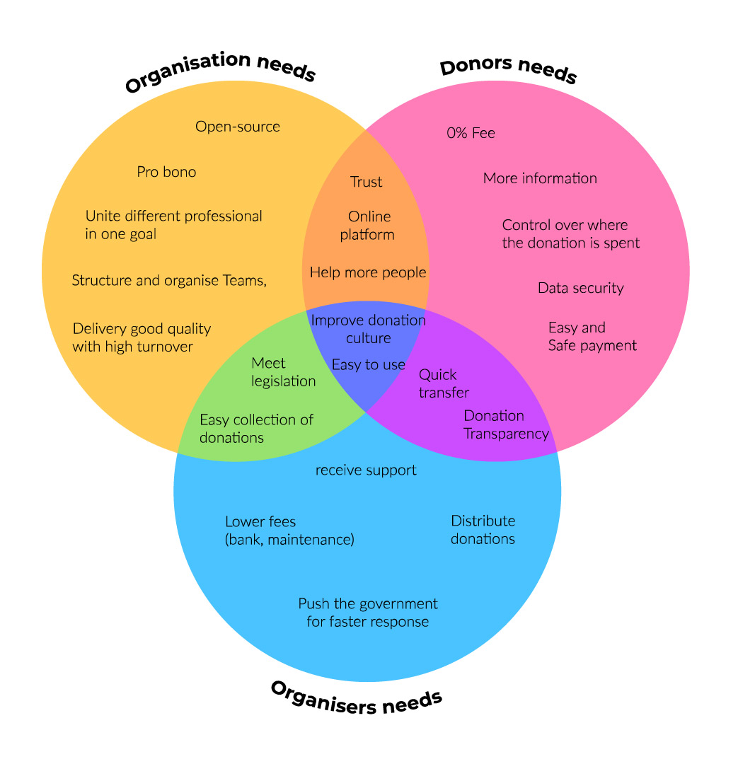
Understanding the User
User Research
- Donors
- Organisers
- Coordinators
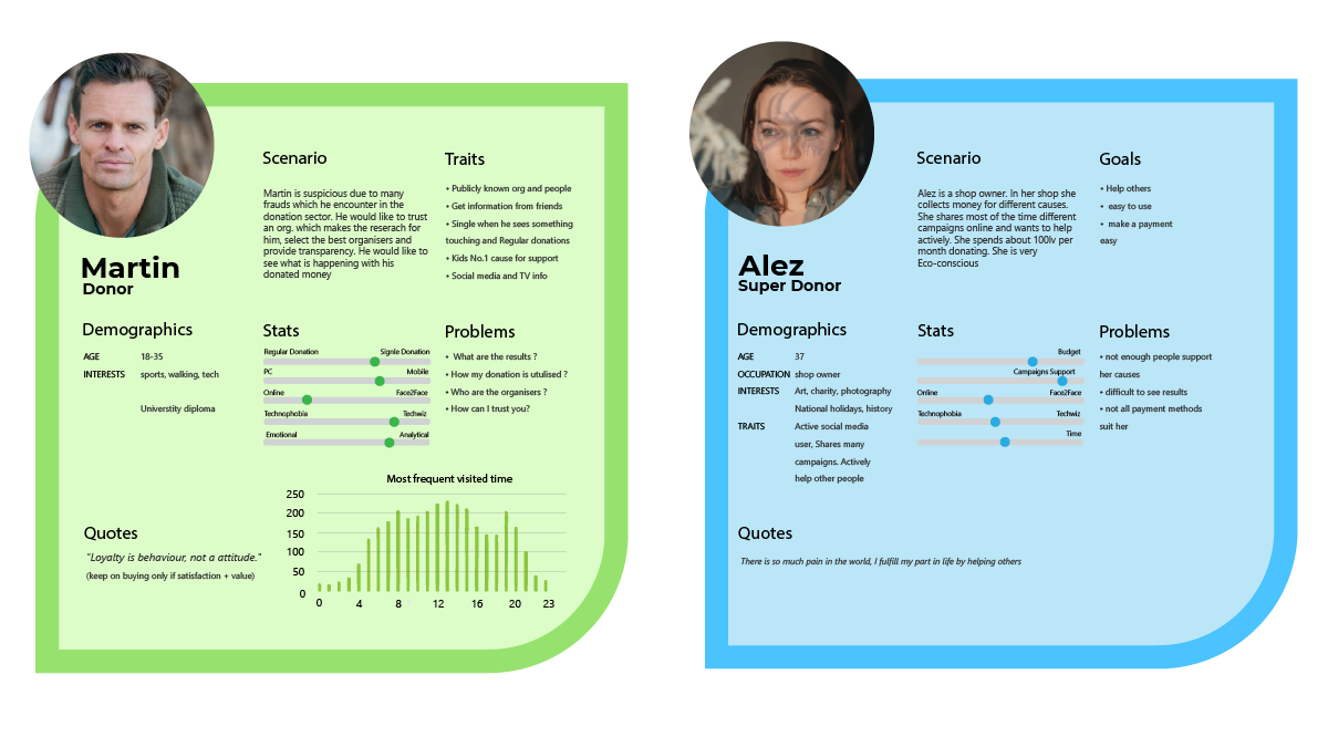
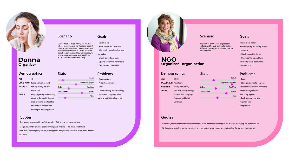
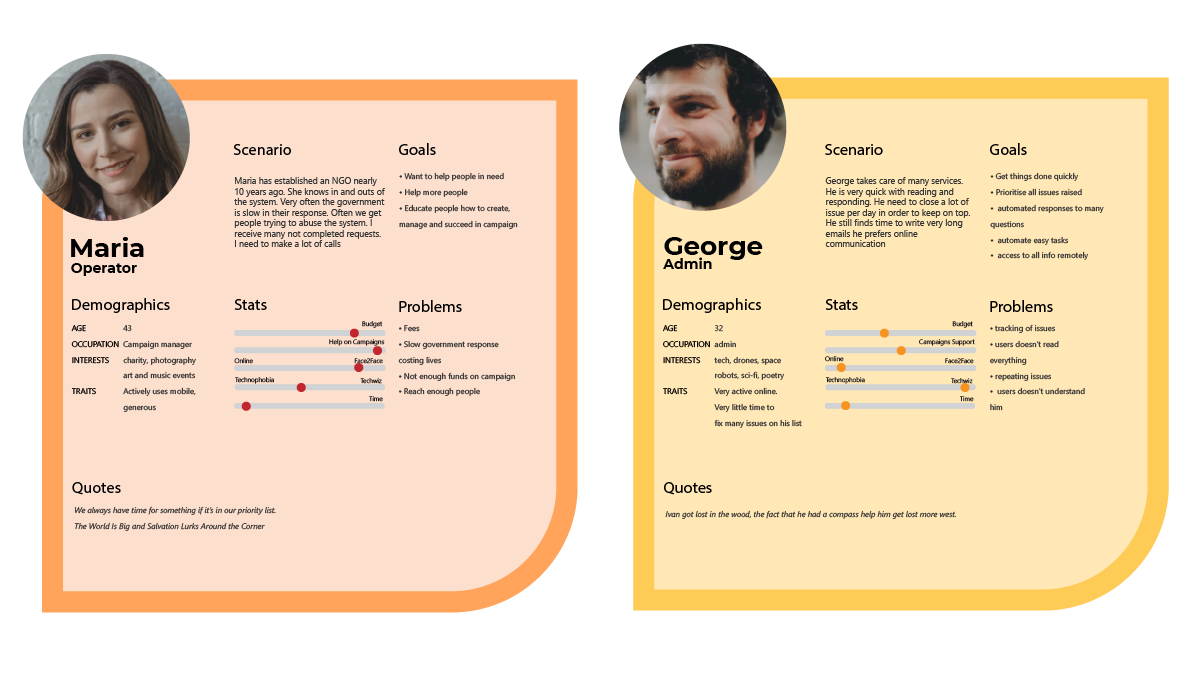
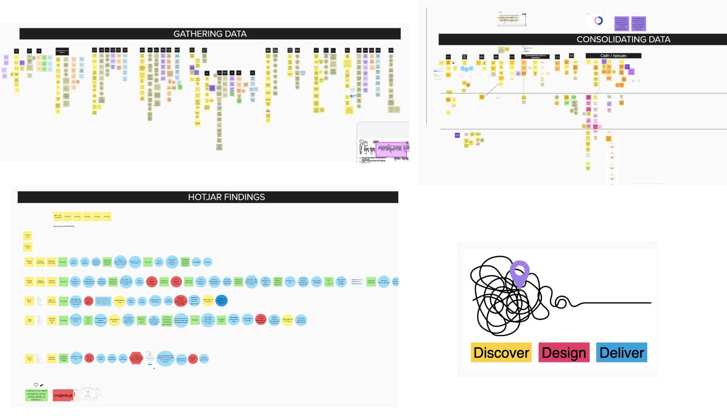
We have conducted over 30 interviews with donors, organisers and volunteers. Initally, conducted the initial 8 interviews with Organisers and Donors. The rest were deviated and conducted with my supervision from outer UX designers. Findings from the interviews were combined with heatmap analysis, academic paper research. We reached to our “competitors” and initiated monthly sessions. In our research we found that Super donator and donator are quite similar.
Also it wasn’t always easy to focus – We found many different problems with organisers:
- difficulties in the distribution of the donation collection of large amount of money online
- money laundering laws
- campaigns are so different that are difficult to automate,
- late government responses for treatment
- not enough information in post-natal care and so on. I took me a while to find a way to focus and define the problems. It is good that we have experienced Product Managers who supported us in the problem definition phase.
Information Architecture (IA) and Flows
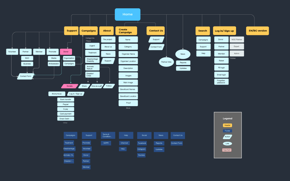
I created an IA of the whole website which helped us to see the bigger picture and to not forget important points in the
User Flows.
Results:
- Analysing the results of the interviews and defining the most important feasible problems which can be resolved by
us - My information architecture – inspired further project organisation by creating mini teams (User registration,
Payments, Campaigns, Data analytics and others)
Branding
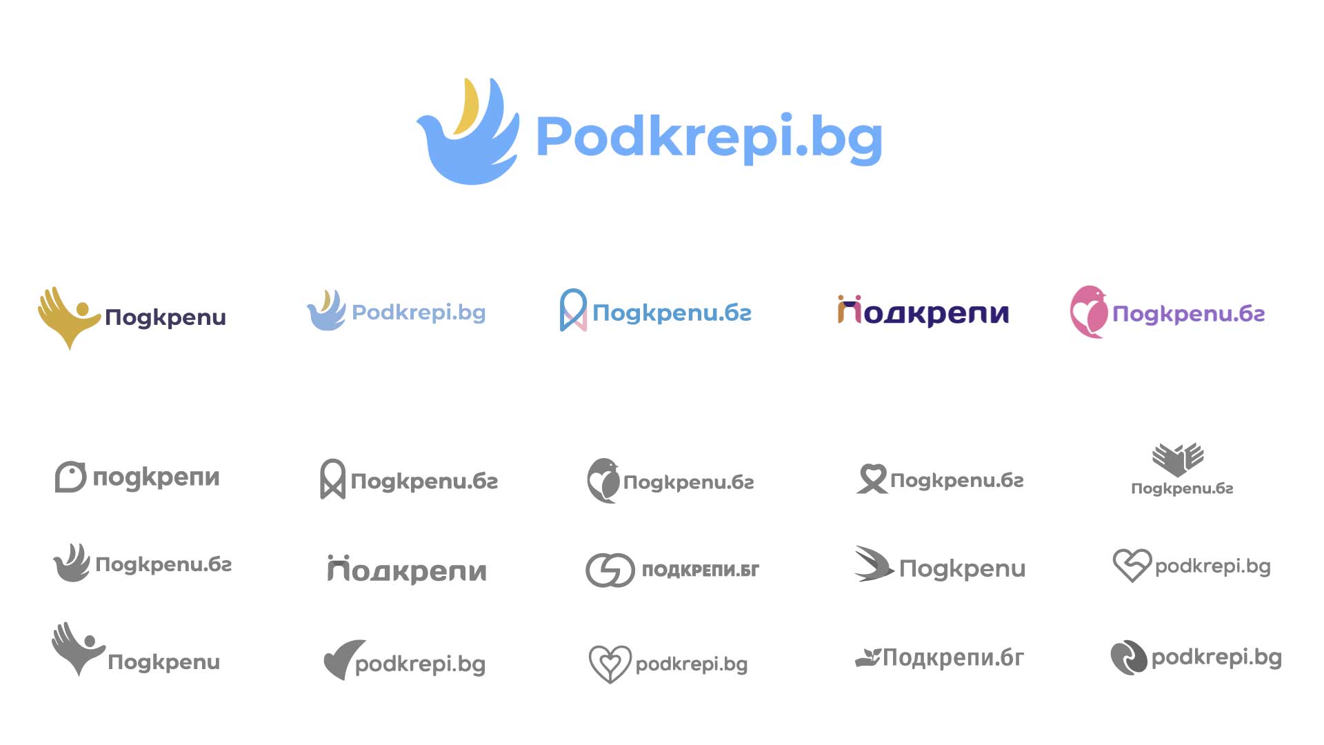
Our design team generated 12 good options. We selected the 5 potential options focusing on symbols which were
embedded in our organisation manifesto. We presented the 5 best to the community and asked for anonymous vote. The
top scorer was become our symbol.

Color Palette
By utilizing these predefined, tested colours, our team managed to dramatically speed up the design-to-development handoff while guaranteeing compliance with necessary WCAG accessibility standards. This ensures our application UIs remain visually consistent and high-quality.


Typography
By standardizing the typeface, weight, and sizing scales, we translate our core brand identity directly into the application interface. This approach maintains high visual fidelity and creates a seamless, professional experience across the entire Application UI
Culture
The vision of creating a large, trusted community of volunteers and donors required an application UI that prioritized ease of use and emotional connection. By designing for our community values—Respect and Proactivity—we successfully realized over $1M in organic fundraising and were recognized as an “Agent of Change.”

Design System
Our design system is developing our 4 core elements:
00 Foundation (Typography, Colour, Grid, Design file structure, …)
01 Components (Cards, Buttons, Search, Icons, …)
02 Libraries ( Illustrations, photos, molecule components, systems)
03 Tokesn (UI-Dev connection, breakpoints, Z-index, border, … )


Information Website
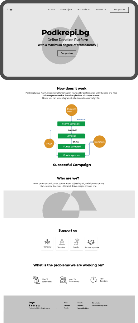
We have done a few different iterations on the Information Website wireframes. I have suggested the final home page
version, building up on the vision of the brand, adding core mission, vision and aims.

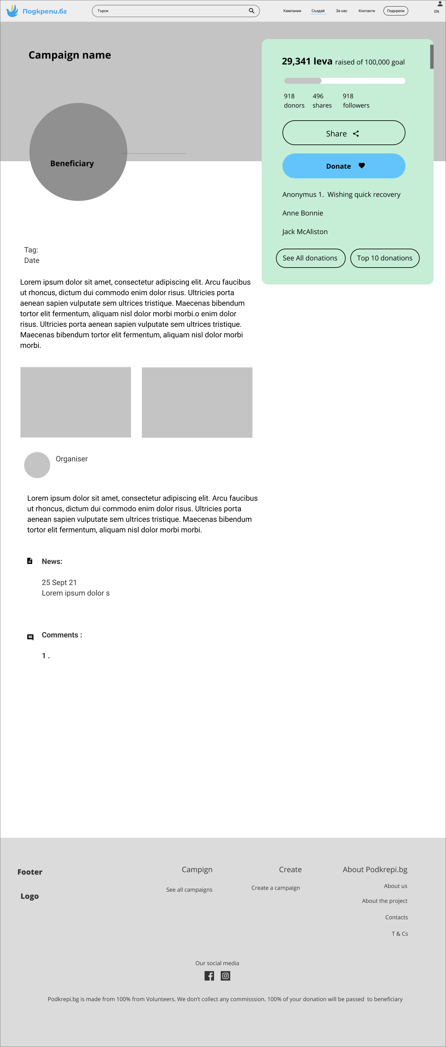

and how the interactions could play out. After some improvements we have now implemented the flow. This task is
ongoing; we now have a bank account which will change the donor platform flow.
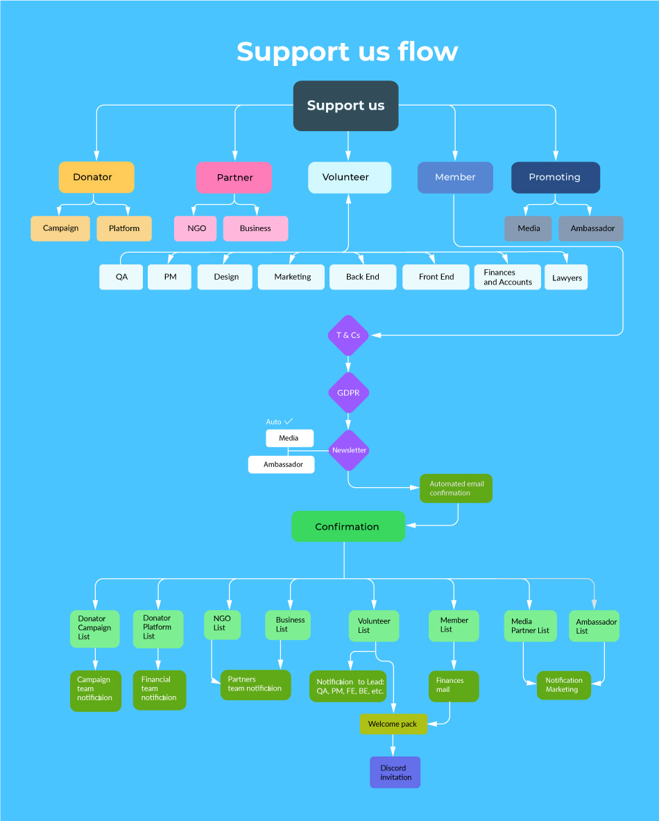
Donation flow v4.17
Below are some of delightful interaction planned in the project
Impact on the project
- One of the strongest organised teams – After the only 2nd week I realised how weekly meeting was pushing us all to
work more. We were the first team in the organisation to book up Thursday 18 00 - Team structure and onboarding – easy to use on-boarding procedure for ever changing volunteer team
- Advocate of user research and not so famous user Persona – I provided user research presentation to the CEO to which
help us to understand my point of view.
I scheduled to do User research directed towards the operator persona - Branding/logo selection – Our teem agreed on a fair community way decision about the logo. We had selected 5 best,
innovative logos and let the community chose the best logo
What did I learn and what would I do differently next time?
1. Never too early for research – In the beginning after stakeholders/platform owners I wasn’t sure which direction we
should take and what is the main aim of the platform. I saw how many and big problems they try to battle. So I step back
and listened in order to focus on the right direction. I think I could have started this straight away.
2. Feedback is crucial – I have tested many decision with group knowledge – Once I have completed any piece of our
work I learned that sharing and receiving feedback improve the ?nal solution. Sometime it raises interesting questions
or other point of view. We don’t work in a bubble community improvements.
Please see other projects
Senior Yoga Project
right type of promotion
Whatsapp Business Concept
a specific target audience
